Austin Ranch Home Remodel – Before and After
Thank you for visiting our Austin ranch home remodel. Our goal with this traditional ranch home was to bring it closer to the mid century modern style. This home already had some elements of the mid-century modern. There was a single living area open to the kitchen. The ceiling was vaulted. It did not have the formal living room usually seen in traditional ranch homes.
We are just occasional diy remodelers. We enjoy sharing ideas with our clients and fellow diy’ers. If you need somebody, and not just anybody, to help you find a home or get your home sold, we’d love to hear from you! We’re full time Realtors with over 30 years experience in Austin real estate.
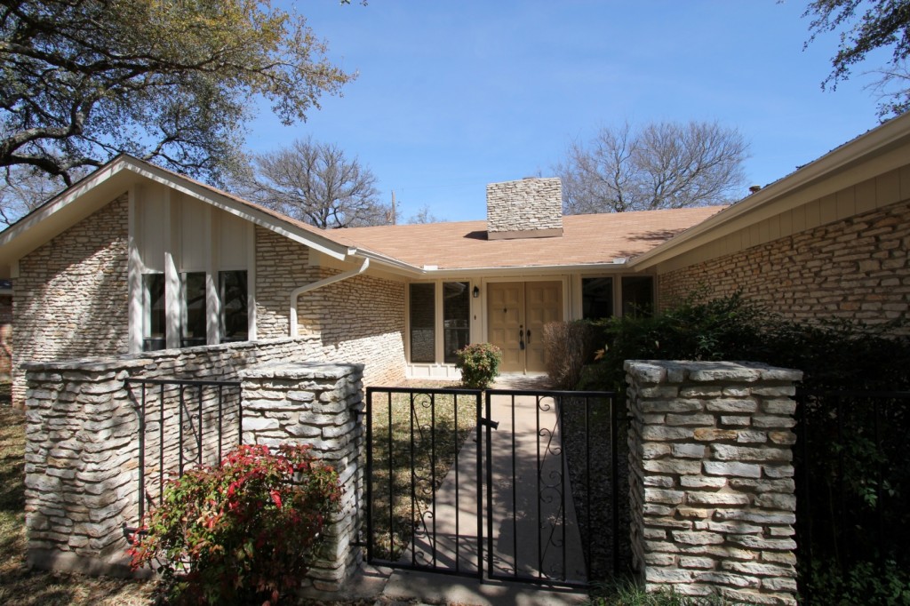
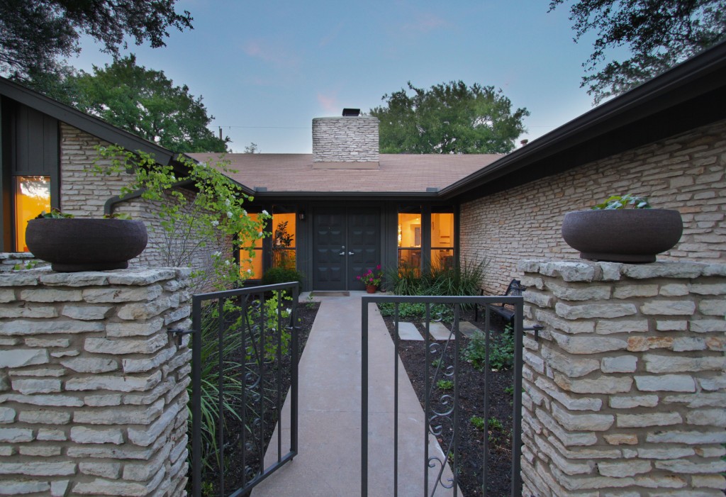
Front After
The small gated courtyard and garden looked intriguing. The two columns in front were begging for pots! A garden bench in the garden area added a place to pause and sit outside. The dark gray color on the trim and gates gave some contrast to the stone. Porpoise, from Sherwin Williams, was used on exterior trim. Urbane Bronze (Sherwin Williams) was used on the front door and gate.
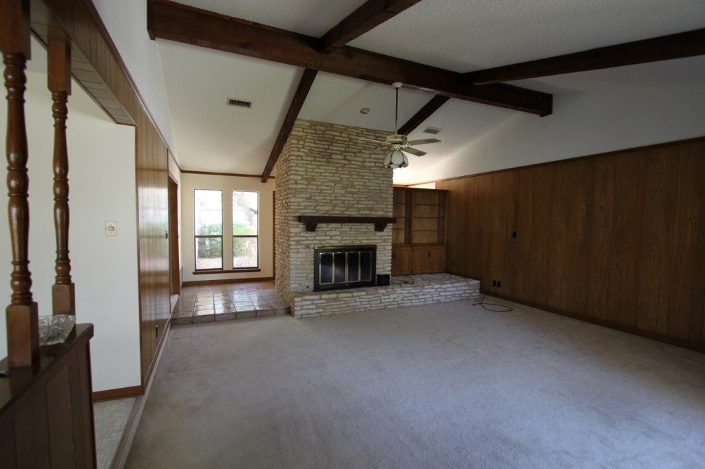
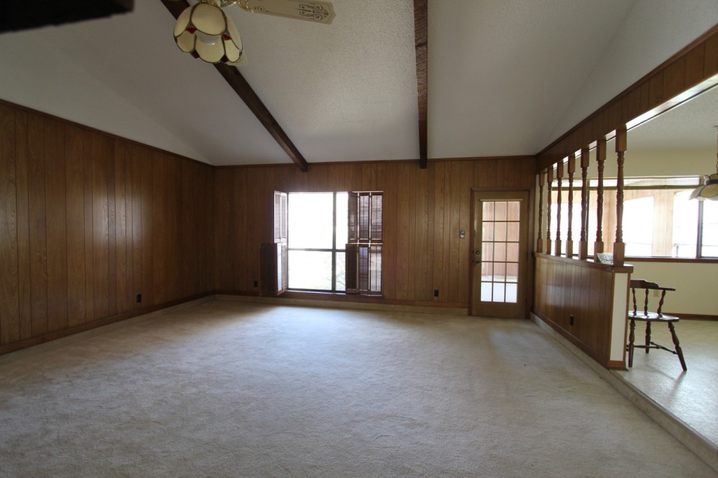
Living Before
This room had some step-down trip issues. To solve the problem we had to pour a layer of concrete and raise the floor. And the room badly needed to be opened up for more light and connection to the outdoors.
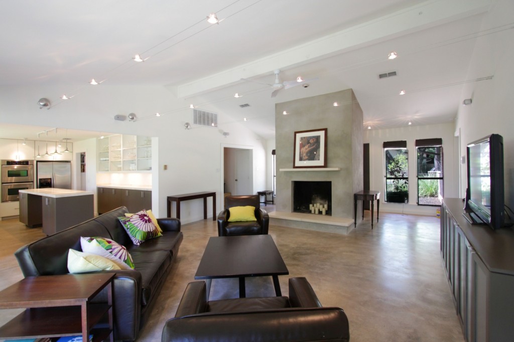
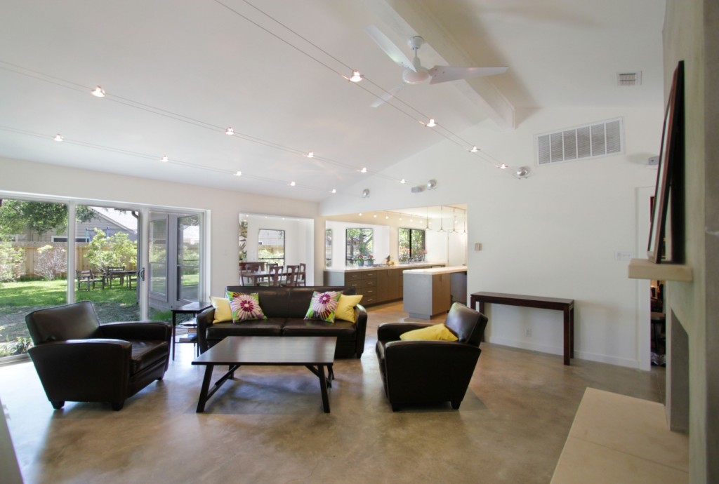
Living After
Opening walls and improving connections between rooms made all spaces feel bigger and better. This low vaulted ceiling was perfect for cable lights.
Living Rear Wall Before
A single window in the living room is just not enough light. The family cave is out!
Living Rear Wall After
A sliding glass door opened the wall to the outdoors. Smooth texture walls and white paint create a light, clean envelope around the space. Opening this wall totally transformed the house.
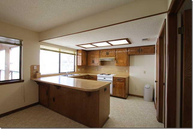
Kitchen Before
There was very little storage in this kitchen, among other problems. Such as the low ceiling with fluorescent fixture. My, those were popular!
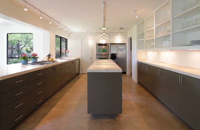
Kitchen After
The wall on the right side was pushed back one foot to make room for cabinets and open shelves. See the next photo of the Study. This kitchen turned out beautiful and very functional.
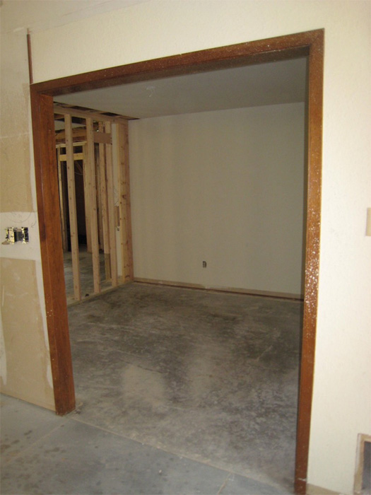
Study Before
The Study was made from this former window-less dining room. A foot was taken from this room and added to the kitchen to make space for open shelves.
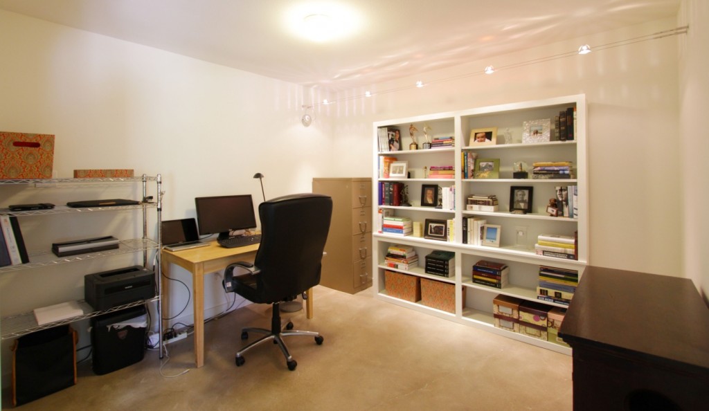
Study After
This space was perfect for a study. The white cabinet is the very one that was on the right side of the fireplace.
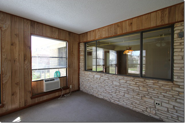
Dining Before
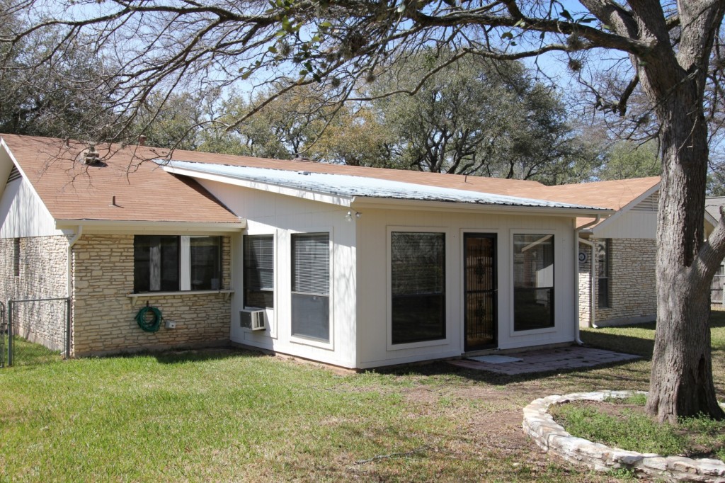
The dining room was made from this cabin-like sun room.
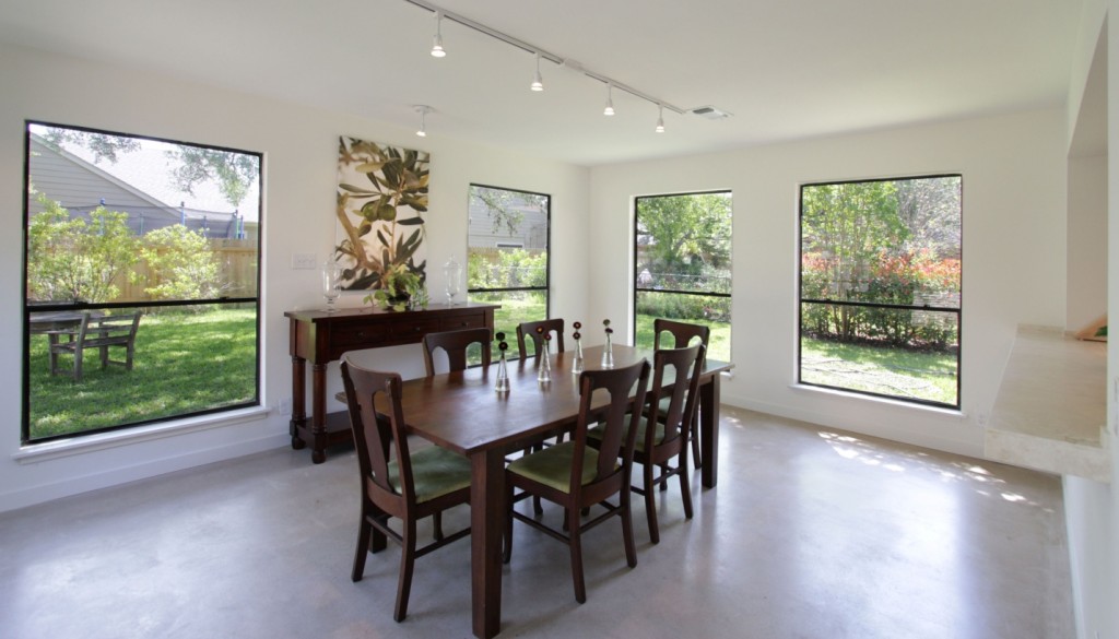
Dining After
Fortunately, the old sun room had lots of windows. So it made a lovely dining room.
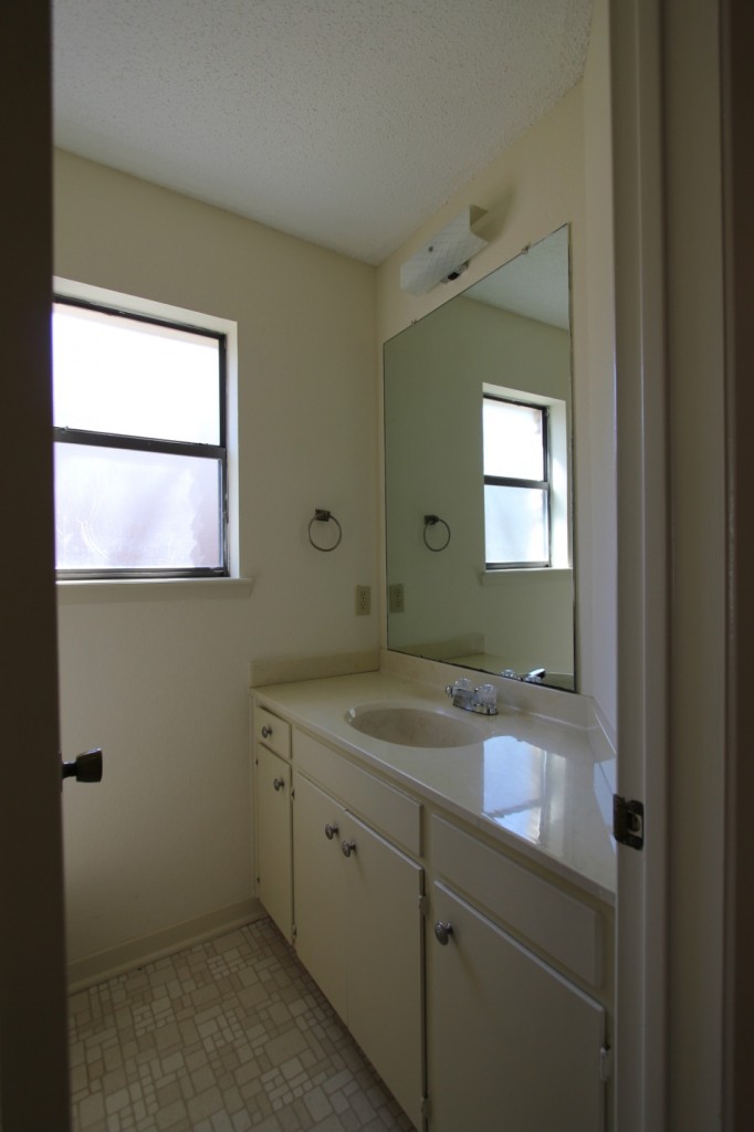
Powder Room Before
It was nice to have a powder room, but some updates were needed.
Powder Room After
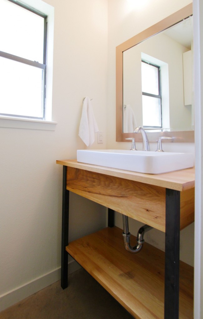
A freestanding wood and iron vanity helped to update the room.
Back Yard Before
The yard was spacious but was chopped up with stones around trees and poor landscaping.
Back Yard After
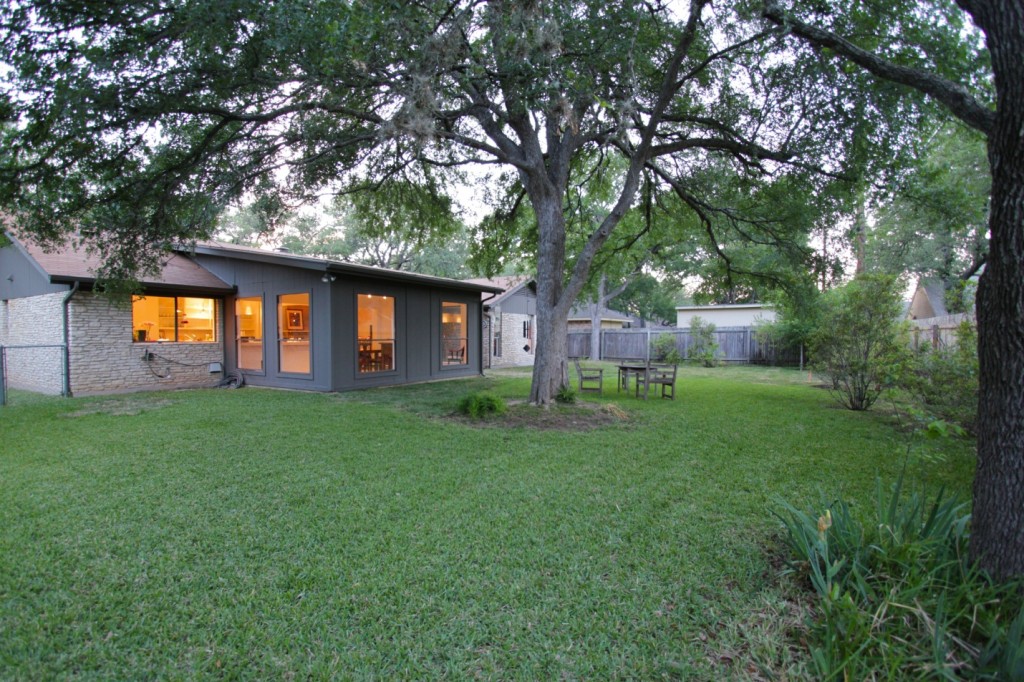
The dark gray helped to improve the look of the old addition. We just added some grass and screening plants to break up the wood fence.
Thank you for visiting our Austin ranch home remodel!
First Post >
All Traditional Ranch Redo Posts >
